Portfolio


After 5 years of programming, I’ve finally launched my own portfolio! Honestly, I’m quite surprised that it took me this long to complete one, as I’d always wanted to make my own blog. In this post, I’ll go in-depth into the process of making one that suited my taste and holds up well in today’s standards.
The Predecessors
To start off, I wanted these baseline features in my website:
- A blog. Somewhere I could write about my thoughts and whatever new JS frontend framework was being released this month.
- Project showcase. A place to review some of the sites that I was the proudest of.
- About. A summary of my character.
- A contact page. Not really sure how I would implement this but perhaps it could be a few external profile links like Twitter, LinkedIn, etc…
This site is not the first edition that came about. I had already built multiple webapps with React + Vite and was well-settled into it, thus I immediately jumped into using it for my portfolio site. Regrettably, this ended up backfiring pretty badly as I didn’t consider some of the issues with building a portfolio as a SPA.
Some of these things were:
- Blog population - how was I going to write my blog posts? I did not wish to type HTML or create components for everything!
- Do I really need so much JS interactivity for a simple portfolio website?
- Writing the entire site in Vite proved a little too barebones. I needed something that would be robust and help me develop quickly - not force me to develop my own workflow pipeline.
Overall, not the best-planned project…
So I went to do some research. Eventually, I came across MDX; an upgraded form of Markdown, which allows you to use components from libraries/frameworks like Vue, React and Astro directly in your markdown content. This seemed incredibly fitting for me as I wanted a way to quickly write content but also give myself some freedom to create custom components.
I explored frameworks that supported MDX and landed on Astro. As luck would have it, Astro 3.0 had just been released at the time and I had heard a lot of exciting prospects about it. Here’s what it looked like:
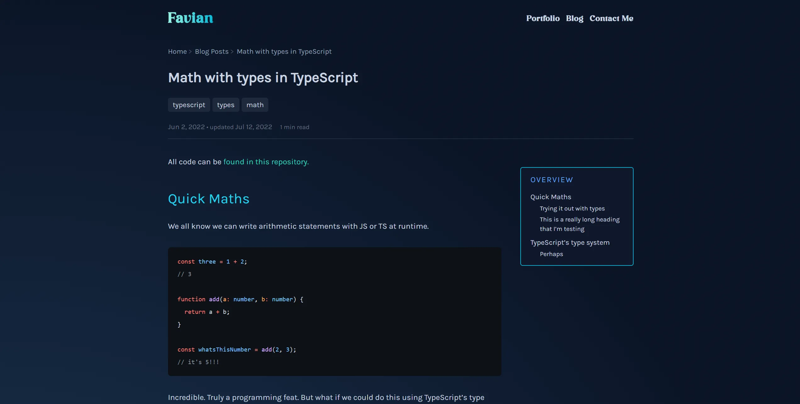
It was certainly an improvement, but there were a number of problems. The code itself was super buggy because I had zero clue of what I was doing in the framework. I couldn’t get many things to work and managing Tailwind’s typography styles was a complete mess. Moreover, I actually disliked the website’s aesthetic; I thought it was too amateur-y and didn’t feel genuine enough. Combined with the inevitable piles of other schoolwork projects, I eventually lost motivation and ultimately abandoned it.
An Upgrade
Fast forward a few years, and I was ready to start building it again. There was a major design overhaul, coupled with the fact that I actually built a prototype in Figma instead of winging it. This site was built with the following tools:
- Astro. This time, I was ready to take the time to understand the inner workings of the framework and would attempt to utilise it to its fullest potential.
- TailwindCSS. Although I faced problems down the road for reasons explained later, I found Tailwind to be very fitting and Astro had already shown that they had immense first-class support for it, so I saw no reason to not take advantage of that.
- Cloudflare. This project is deployed on Cloudflare Pages.
- React. Astro’s ‘islands’ architecture would support React interchangeably. I saw an opportunity to use this.
Using Tailwind
Tailwind had already proven itself to be a great boon in my previous projects, making it enjoyable to style HTML. In this project, however, things change when it comes to markdown.
Typography plugin
Tailwind offers a plugin called @tailwindcss/typography specifically for styling rendered
markdown content. It offers fast and sensible defaults through the use of just one class - prose.
This seemed like a perfect addition to my project, as despite the lack of need for markup anymore, I still didn’t want
to style every component on my own!
Unfortunately, Tailwind really shows its ugly side here. Here’s a snippet from when I initially used the plugin in this project:
class:list={[ // non-tailwind classes left for brevity "prose", "prose-h1:text-white prose-h1:text-5xl", "prose-h2:text-primary prose-h2:text-4xl", "prose-h3:text-primary prose-h3:text-xl prose-h3:font-bold prose-h3:tracking-widest prose-h3:mt-12", "prose-li:text-white prose-li:text-lg prose-li:font-body", "prose-strong:text-white prose-em:text-white", "prose-code:text-white prose-code:font-display prose-code:before:content-[''] prose-code:after:content-['']", "prose-figcaption:place-self-center prose-figcaption:font-body", "prose-headings:scroll-mt-32 prose-headings:relative", "prose-code:[&:not(pre_code)]:bg-white" // ...]}That’s not even all the styling I wanted to apply! Honestly, I didn’t expect the level of rigidity here. Most of the stylings were finicky to control through Tailwind, as selectors would get incredibly verbose. After some evaluation, I decided to bite the bullet and dropped the library in favour of styling everything myself in one big stylesheet.
That worked for a while, but it came with its own problems. The styles leaked outside of the article, overrode any utility class I put
on an element, and quietly skipped elements I hadn’t written rules for, like bullet lists and blockquotes. So I eventually came back to
the plugin - this time without the giant class list. prose provides sensible defaults for every element, and my own tweaks live in a
small, plain CSS file that sits in Tailwind’s utilities layer, after the plugin’s styles:
@layer utilities {  .content {    /* skip anything inside .not-prose, just like the plugin does */    & :where(:not(.not-prose, .not-prose *)) {      &:where(h3) {        font-family: var(--font-display);        letter-spacing: 0.2rem;        text-transform: uppercase;        color: var(--color-primary);      }
      /* ... */    }  }}
Components that want to style themselves, like the interactive demos in this post, simply opt out with a not-prose class.
Moral of the story; try it out yourself first, before reaching for a library - and don’t be afraid to come back to one with a different approach. I’m not saying to reinvent the wheel every time here - Tailwind Typography is great for bunch of default styling that looks decent, but consider the tradeoffs when using a library like this.
Dealing with v4
In January 2025, Tailwind released a new major version, v4. This update included a ton of exciting new features, like the CSS Tailwind
config file (finally!), the not-* variant, and the new Oxide engine.
I was keen to try it out, so in the middle of development, I upgraded to v4. This was not the brightest idea in hindsight, because initially the new architecture became remarkably annoying to use. I felt myself fighting the library at times; “why did they make it this way,” and “why can’t I just do this?”
But I was proven wrong! v4 is an excellent upgrade to v3 in almost every way, and I just didn’t understand the vision at first.
One thing the Tailwind team has always advised against using is the @apply rule, which is perplexing. This is made even more prevalent
in v4, where using @apply carelessly would lead to some not-insignificant issues. But why?
On the surface, it seems like a convenient way of applying Tailwind styles to custom CSS! Take this example, where we have a somewhat complex selector:
@reference "tailwindcss";
#alert {  &[data-type="info"] pre {    @apply bg-slate-900/80 border-l-2 border-l-blue-500;  }}
Consider the equivalent without @apply in Tailwind and regular CSS:
<aside id="alert" data-type="info" class:list={[ "bg-blue-950/40 border-l-4 border-l-blue-300/60", "data-[type='info']:[pre]:bg-slate-900/80", "data-[type='info']:[pre]:border-l-2", "data-[type='info']:[pre]:border-l-blue-500",]}>#alert { &[data-type="info"] pre { background-color: color-mix(in oklab, var(--color-slate-900) 80%, transparent); border-left-style: solid; border-left-width: 2px; border-left-color: var(--color-blue-500); }}Both of these options are far more verbose. So what’s wrong with @apply, really?
There are a few problems. To understand them, let’s talk about the terminology of styles in Astro.
When we use the <style> tag in an Astro component, our styles are scoped to that component by default. Astro rewrites each selector
with a unique attribute (p becomes something like p[data-astro-cid-x8kzm4dj]), which means that if we select <p> tags in the component,
we only select ones that the component renders itself - not ones passed in through a <slot>, unless we explicitly reach for :global().
The advantage of this is these component styles don’t bleed into elsewhere in our app, which could cause unpredictable results.
Scoped styles are a very common paradigm in component frameworks nowadays - Vue and Svelte do the same, and CSS Modules achieve a similar effect.
Unfortunately, Tailwind doesn’t play well with them. Firstly, whenever we use @apply in a scoped <style> block,
we need to use @reference "tailwindcss"; (or a path to our own stylesheet) to link up Tailwind. This gives us access to either the
default Tailwind styles or our own theme. The tradeoff is that each of these <style> blocks is processed by Tailwind separately -
sprinkle @apply and @reference across lots of components, and that extra work adds up in your build times.
So what’s the solution? Well, Tailwind recommends just simply making more isolated components with their own Tailwind classes, rather than depending on complex selectors. There is a natural inclination towards such a mentality when using libraries/frameworks like React/Astro, but sometimes you need that specificity. It takes a bit more consideration when building your components, but it’ll be worth the faster load speeds.
Content Collections
The one core Astro feature that populates my website is content collections. They’re essentially just a set of data, like JSON files or entire blog posts, stored locally on the project.
Here’s how my projects collection is defined. Blog posts and projects share most of their fields, so those live in a common post schema:
const post = z.object({  title: z.string(),  description: z.string(),  pubDate: dateField, // a small helper that parses dates with date-fns  draft: z.boolean().optional().default(false),  tags: z.array(reference("tags")).default([]),  related: z    .object({      blog: z.array(reference("blog")).default([]),      projects: z.array(reference("projects")).default([]),    })    .default({ blog: [], projects: [] }),});
const projects = defineCollection({  loader: glob({    pattern: "**/*.mdx",    base: "./src/content/projects",  }),  schema: z    .object({      url: z.string().optional(),      githubUrl: z.string().optional(),    })    .extend(post.shape),});
defineCollection needs 2 props - loader & schema. loader specifies how Astro parses your media, with glob being
file path matching, and file, which loads JSON files via an exact path.
schema is how you format your markdown. Astro uses Zod internally for you to streamline the creation of
your frontmatter schema and provide generated Typescript types in the project. Pretty neat!
To demonstrate how the schema works, the frontmatter for this project looks like this:
---title: "Portfolio"description: "This very website :)"pubDate: "2025-02-01"draft: falsetags: - "typescript" - "astro" - "react" - "motion" - "tailwindcss" - "cloudflare"---Astro verifies the structure of the frontmatter whenever it syncs your content - on every build, and whenever a file changes in dev.
For example, if title was omitted, Astro would complain and throw an error, and the build would fail.
Dates get a little extra care. A date like pubDate: "2025-02-01" has no time or time zone attached, and the usual
z.coerce.date() reads it as midnight UTC. Anything that later formats that date without spelling out a time zone uses the time zone
of whichever machine builds the site - so a server a few hours behind UTC would happily publish this post as January 31st!
Instead, dateField parses every date with date-fns, treating a date-only value as that calendar day in
Singapore, wherever the build runs:
const dateField = z.union([z.string(), z.date()]).transform((value, ctx) => { try { return parseDate(value instanceof Date ? value.toISOString() : value); } catch (error) { ctx.addIssue({ code: "custom", message: (error as Error).message }); return z.NEVER; }});const inSiteZone = tz("Asia/Singapore");
export const parseDate = (value: string): Date => { const date = parseISO(value, { in: inSiteZone });
if (!isValid(date)) { throw new RangeError(`Invalid ISO date: "${value}"`); }
return date;};
export const formatCompactDate = (date: Date) => format(date, "dd/MM/yy", { in: inSiteZone });The same helpers format every date on the site, so the published date always comes out the same. And a typo like "2025-13-45" still
fails the build as a schema error, now with a message that points at the exact value: Invalid ISO date: "2025-13-45".
As you’ve seen above, there are a quite a number of data types that are available for use in the schema. However, there is a special
type created by Astro that’s not natively in Zod - reference. It essentially allows you to refer to another collection entry via
its id (for files loaded with glob, that’s derived from the file path, e.g. java-bitjam). A collection can even reference itself!
For instance, the shared post schema references the tags, blog and projects collections - so a project can even list
other projects as related:
const post = z.object({4 collapsed lines
title: z.string(), description: z.string(), pubDate: dateField, draft: z.boolean().optional().default(false), tags: z.array(reference("tags")).default([]), related: z .object({ blog: z.array(reference("blog")).default([]), projects: z.array(reference("projects")).default([]), }) .default({ blog: [], projects: [] }),});This is the way that it had been working for a while now. But a peculiar issue came up one day when I added those 2 types and ran the project:
Cannot destructure property 'type' of 'lookupMap[collection]' as it is undefinedThis was odd to me. I was sure that I had typed the schema correctly, as per the docs. So why wasn’t it working?
Turns out, it was a bug on Astro’s side. The GitHub issue itself has since been fixed and closed, but essentially, a race condition would occur where Astro would try to assign the record to a collection without the collection actually existing in the first place. This mismatch causes the project to stop building and fail. This was a very frustrating error as it was difficult to pinpoint exactly how it went wrong. It took a lot of research and time for it to get fixed!
In the meantime, I did discover a workaround involving the .astro folder. This is what it looks like, with other files omitted for brevity:
collections
blog.schema.json
projects.schema.json
tags.schema.json
actions.d.ts
content.d.ts
types.d.ts
The collections folder is where Astro stores the parsed content schemas. I suspected the problem was the definitions themselves,
so I deleted the folder and regenerated it, which actually fixed the problem. Not the best solution, but it allowed me to work on other
things in the project.
Creating the layout
If you inspect this page with dev tools, you’ll see that I use CSS grid. Initially, I used flexbox to create the layout for the page, but it just didn’t feel right.
I’ve prepared a rough demo below. It’s a scaled-down version of the layout: it responds to the slider instead of your screen, so its breakpoints don’t line up exactly with the real page, but the idea is the same. If you’re on mobile, you may have to switch to a bigger device to see the full layout. Adjust the slider to change the width of the viewport:
So, how was this accomplished?
On mobile devices, the page is a single column holding only the article content, with plain padding on either side - 2rem on phones,
and 5rem once we pass the sm threshold. ToCs (Table-of-Contents) are not space-efficient on smaller screens, so we remove that
functionality entirely.
When we have a big enough viewport, we don’t want the content to reach the ends of the screen. This can make reading feel clunky
and difficult to digest, as the content is spread over a large area. To prevent this, we need some sort of spacing on the
horizontal axis of the page. We have two solutions: either keep using padding, or grid columns. From the md threshold onwards,
we’ll pick the latter option, for reasons I’ll explain soon.
At md, the padding is dropped and the article becomes the middle of three columns: an empty 1fr column on each side, and the content
column fixed at 60ch. 1fr is a grid-exclusive unit that simply means; “occupy the remaining space”. Once we pass the lg threshold,
there’s finally enough room for the ToC, so it gets its own fixed-width column next to the content. Past that, the content and ToC columns
just get a little wider at xl and 2xl.
We can achieve all these through the use of grid-template-columns. Here’s what the page uses at the xl threshold:
article { display: grid; grid-template-columns: 1fr 72ch 22rem 1fr;}And here are the classes on the <article> that set this up at every size (simplified - the real code reads the widths from theme variables):
<article class:list={[ "grid grid-cols-1 justify-center px-8 sm:px-20", "md:px-0 md:grid-cols-[1fr_60ch_1fr]", "lg:grid-cols-[1fr_62ch_18rem_1fr]", "xl:grid-cols-[1fr_72ch_22rem_1fr]", "2xl:grid-cols-[1fr_80ch_22rem_1fr]", ]}>The demo above uses the same idea, but with @-prefixed classes like @md:grid-cols-[1fr_16rem_8rem_1fr], so that it reacts to the
slider rather than your screen.
So why exactly did we choose these columns over the reliable padding property once the screen is wide enough? It’s kind of a personal
preference. Let’s consider how the same layout stretches/shrinks with padding in place of the 1fr columns:
As you can see, it’s quite similar at the widest and narrowest sizes. But in between, the difference shows: padding is a fixed size, so
as the space shrinks, the fixed-width content and ToC columns end up running over it instead of the spacing giving way. The 1fr columns,
on the other hand, simply shrink to whatever space is left. While this doesn’t really matter much as that space is empty anyway, I still
find the padding version a little unrefined, hence I prefer using fr once there’s room for it. On small screens, where there’s no
fixed-width column to protect, plain padding does the job just fine.
Interactive sections
You may be wondering how components like the filetree and grid layout example exist. After all, aren’t I just using markdown to write these pages? Well, thanks to the combined power of Astro, React, & MDX, this is possible and it’s so cool to be able to create these mini interactable sections while still writing plain text.
Islands
Astro introduces the concept of ‘islands’, which is a relatively new architecture in the web dev space. Astro’s docs explain it best. To understand it, we first need to elaborate on the concept of hydration.
To put it briefly, hydration means adding JavaScript interactivity to a static page. We defer this process until after the HTML/CSS has finished loading, as JS is one of the slowest forms of data to send to the client. This gives the page a ‘complete’ appearance, though in actuality lacks any functionality.
There are different ways to hydrate a web page - for example, in SPAs (Single-Page-Apps), hydration is often done all at once, slowing load speed. SPAs are usually reserved for web apps that contain a large amount of JS functionality, like dashboards and e-commerce sites.
Astro islands also perform hydration, but rather on a component-level basis. This basically means that most of the web page remains static, while only the components that you specify will require JavaScript hydration, keeping load times low and the page fast.
There are two types of islands; client and server. For brevity, I’ll only cover client islands in this post.
To create a client island, we use the client:* directive on a component as follows:
<HelloWorld client:load />There are a few client* directives available:
client:load- Load and hydrate the component immediately on page loadclient:idle- Load the component when the browser becomes idleclient:visible- Load the component when it enters the viewport
Using React
I write these interactive components in React, which I wrap around an Astro component, <Frame>. As of now,
<Frame> only provides common stylings - each demo picks its own client:* directive (the layout examples above use client:visible),
but I have plans to make it more composable to allow more interactivity in the future.
Hosting
I’m glad I haven’t found a need to opt for full SSR on Astro yet. With islands, this is essentially isn’t an issue, and I’m able to
deploy on Cloudflare Pages for free!. The workflow was pretty easy, to be honest - just connect Cloudflare Pages to a repo and wait for it
to finish building. I had already set up a CNAME record prior to this, so I could just use it straight away. The whole process took something
like 10 minutes.
Originally, I bought my domain on Namecheap. It was relatively inexpensive; I pay 15 SGD a year for it. I’ve since moved it to Cloudflare as it’ll be easier to work with in the future.
Closing words
I’ve come a long way since writing my first line of Java code in my polytechnic years. This portfolio website is only the beginning to my journey as a software developer! There’ll be many ups and downs along the way, but they’ll all be learning experiences :)